stingers coffee
Stingers Coffee is a local coffee shop in Corpus Christi, Texas. They offer several different types of coffee and snacks, as well as Keto Diet-friendly coffee and food options. Their current target audience is older women, but this project was intended to focus on a younger demographic. As part of a Corporate Identity class, this project gives Stingers a corporate identity makeover and gives them several, more professional assets to use such as a new logo, a new brand identity, and a new website that reaches out to a younger target audience and has a more modern vibe.
before

after


"I wanted to incorporate the honeycomb shape into their logo and brand identity."
In my research, I looked at other local coffee shops that offered similar things to Stingers. I looked at stores such as Coffee Waves, which is a hop and a skip away from Stingers. Along with local coffee shops, I also looked at places such as Starbucks, to see what an actual corporate identity was doing for branding and advertising.
With this information, I narrowed down a new target audience for Stingers which included adults between the ages of 18 to 40, with a particular focus on college students, since Texas A&M University-Corpus Christi is about a five minute drive from their main store. The target audience would also most likely be on-the-go as they would be on their way to work or school when picking up a drink from Stingers. Their interests would probably include being physically active and supporting local businesses.
For my solution, I made a logo that I think suits their overall brand feeling. Generally, you think of the dotted lines and the honeycomb shape, so I incorporated these into my logo, and then used a modern sans serif typeface to tie the mark and typography together. For color, I wanted to stick to the black and yellow that is also typically associated with bees.
"Creating this project really helped me realize just how much work goes into creating an entire identity for a larger brand."
The annual report was probably the most challenging part of this project for me, because I struggle when it comes to editorial design.
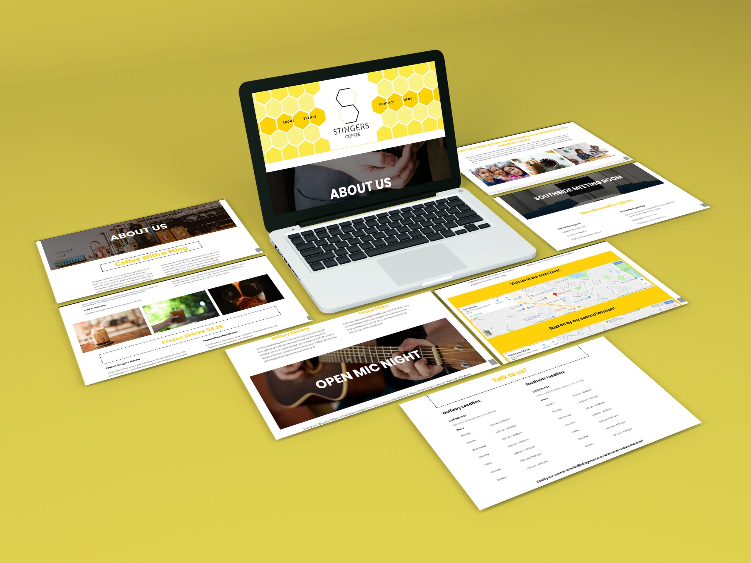
Lastly, for the website, it needed to be more logically organized, because the new target audience is most likely going to look up Stingers’ menu online before going into the store, and Stingers’ menu was quite unorganized.
I presented all of the elements I had created to my classmates, friends and family members that all fell in the age range, and some of them also had the same interests that I assumed the target audience would have. Most of the feedback I received was positive overall. Some stated that the new identity was more refreshing and more fun than the old identity. It was also mentioned that this newer identity could be used in a very corporate setting.
Overall, this project was fun to work on, because branding is something that I really enjoy doing. I think that if I could do the project over again, I would see how much more creative I can get with the brand system. The website seemed to be the main success of that part of the project, but I think that I could push the letterhead further with subtle details. This was definitely one of my more successful projects, and the processes involved in creating this project really helped me realize just how much work goes into creating an entire corporate identity for a larger brand.


For the Mailchimp e-blast, I thought it would be fun to do a simple animation that would catch the viewer’s eye. This would be more interesting than seeing a simple static graphic that displays the brand, but doesn’t fully pull the viewer in.
For the brand system, I wanted to give them a fun pattern that could be used in several design applications. Their letterhead and business card were put together with the idea that these would be given or sent to potential investors or sponsors.


